Rage Collections x NRS Departmental Store: Retail Staff Apparel Case Study
Project Summary
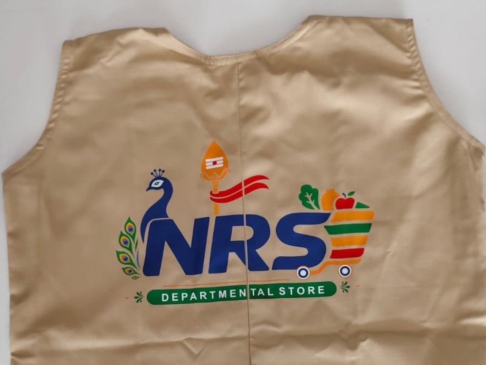
This professional portfolio case study highlights a beige sleeveless vest designed by Rage Collections for NRS Departmental Store. The project showcases a retail-focused brand identity concept, featuring a detailed custom logo with a peacock, spear symbol, and a grocery shopping cart graphic. Discover how these vibrant elements combine to create practical, recognizable staff apparel for a retail environment.
Garment Introduction
This case study examines a light beige sleeveless vest created by Rage Collections for NRS Departmental Store. Designed for ease of movement and daily wear, the garment serves as functional staff apparel that brings a distinct retail identity to life.
Concept and Idea
The core concept centers on retail branding, local cultural connection, and customer accessibility. The idea was to create a functional garment for store employees that incorporates traditional symbols alongside everyday grocery elements, ensuring staff are instantly recognizable to shoppers on the floor.
Design Story
The design tells a rich visual story tailored specifically for a neighborhood departmental store:
- Cultural Accents: A graceful blue peacock with colorful feather details stands on the left, paired with a traditional spear emblem above the main lettering.
- Brand Typography: Bold blue “NRS” letters form the central anchor of the logo.
- Retail Integration: The letter ‘S’ seamlessly flows into a colorful grocery shopping cart filled with fresh produce like leafy greens and a bright red apple.
- Store Classification: A solid green badge at the bottom clearly displays the white text “DEPARTMENTAL STORE.”
Purpose and Target Audience
- Primary Purpose: To function as recognizable staff uniforms or promotional wear for employees working within NRS Departmental Store.
- Target Audience: Store workers, customer service representatives, and shoppers looking for an easily identifiable team presence in a retail setting.
Challenges
A major design challenge was combining multiple intricate components—a peacock, cultural symbols, bold typography, and a grocery cart graphic—into a cohesive layout on a sleeveless garment. Maintaining visual clarity and balance without making the branding look overcrowded required precise scaling and placement.
Creative Process
- Symbolic Integration: Weaving local and retail motifs together to reflect both identity and the nature of the business.
- Color Harmony: Balancing vibrant blues, greens, yellows, and reds against a neutral beige fabric background to ensure the logo stands out clearly.
- Layout Balance: Positioning the complex multi-element emblem centrally to maximize visibility and professional presentation.
What Makes the Garment Special
What sets this apparel apart is its storytelling design. Rather than relying on simple text, the logo blends cultural heritage with everyday supermarket imagery, turning standard staff wear into an engaging and memorable representation of a community store.
Final Result
The final result is a practical, visually rich garment that successfully merges retail functionality with detailed corporate branding. It provides store personnel with a distinctive uniform that stands out clearly in a busy retail environment.
How It Represents Rage Collections
This project demonstrates Rage Collections’ versatility in designing specialized workwear and retail merchandise. It highlights the brand’s ability to incorporate complex, multi-element logos and custom graphics into clean, wearable apparel solutions tailored to local businesses.