Rage Collections x GEE: Corporate Merchandise Case Study
Project Summary
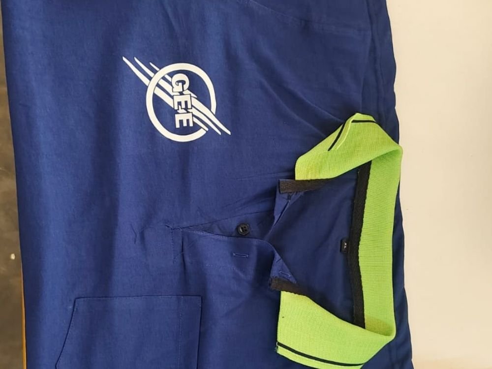
This professional portfolio case study highlights a royal blue polo T-shirt designed by Rage Collections for GEE. Featuring a vibrant lime green contrast collar, a practical chest pocket, and a dynamic white logo emblem on the chest, the garment blends modern corporate identity with everyday utility. Discover how this striking color combination and clean branding create professional, recognizable apparel for team environments.
T-Shirt Introduction
This case study examines a royal blue polo T-shirt created by Rage Collections for GEE. Built on a classic polo silhouette featuring a button placket and a functional chest pocket, the garment serves as corporate merchandise designed to combine everyday comfort with a distinct visual identity.
Concept and Idea
The core concept centers on corporate identity, high-visibility contrast, and practical functionality. The idea was to design a professional workwear piece that stands out through an energetic color pairing—matching a deep royal blue body with a vibrant lime green collar—while maintaining a clean corporate look.
Design Story
The design tells a clear visual story tailored for corporate branding:
- Color Contrast: A bright lime green ribbed collar provides an instant pop of color against the deep royal blue fabric.
- Chest Branding: A clean white logo on the chest features the acronym “GEE” enclosed in a circle, accented by dynamic diagonal motion lines.
- Functional Detailing: A neatly stitched pocket is integrated into the lower-left front for daily utility.
Purpose and Target Audience
- Primary Purpose: To function as professional staff uniforms and corporate merchandise.
- Target Audience: Company employees, team members, and corporate representatives looking for comfortable, easy-to-identify daily workwear.
Challenges
A key design challenge was balancing high-contrast colors—royal blue, lime green, and white branding—so that the garment remained professional rather than overly casual. Ensuring the logo stayed crisp and prominent against the blue base required careful positioning.
Creative Process
- Color Selection: Pairing a dependable royal blue fabric with an energetic lime green collar to create a memorable visual contrast.
- Logo Placement: Sizing and positioning the “GEE” motion-stripe emblem cleanly on the upper chest.
- Utility Integration: Adding a practical chest pocket without disrupting the overall layout of the shirt.
What Makes the T-Shirt Special
What sets this polo apart is its striking color combination and functional design. The unexpected pairing of a lime green collar with a royal blue body, combined with a dynamic motion-logo and a pocket, turns standard workwear into a stylish piece of branded apparel.
Final Result
The final result is a polished, energetic polo T-shirt that merges practical utility with modern corporate styling. It offers a professional yet distinctive appearance suitable for everyday operations and team coordination.
How It Represents Rage Collections
This project demonstrates Rage Collections’ capability to design functional, stylish corporate merchandise with unique color identities. It highlights the brand’s skill in blending practical workwear elements with striking visual branding tailored to specific client needs.