Rage Collections x PFI Tirumala TMT Steel: Industrial Apparel Case Study
Project Summary
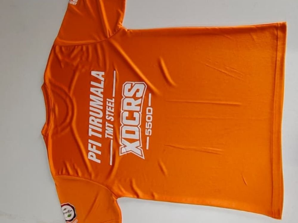
This professional portfolio case study highlights a vibrant orange T-shirt designed by Rage Collections for PFI Tirumala TMT Steel. The project features bold industrial branding, showcasing the “XDCRS -550D-” product line with striking white typography on a high-visibility orange base. Discover how clean graphic alignment creates professional, rugged merchandise tailored for the steel and manufacturing sector.
T-Shirt Introduction
This case study examines a bright, high-visibility orange round-neck T-shirt created by Rage Collections for PFI Tirumala TMT Steel. Built for active environments, the garment serves as branded apparel that merges industrial utility with a striking visual statement.
Concept and Idea
The core concept centers on industrial strength, brand visibility, and product identification. The idea was to design a garment that highlights a specific steel product line (“XDCRS -550D-“) while utilizing an energetic safety-orange color palette common in heavy manufacturing sectors.
Design Story
The design tells a clear industrial branding story across the back of the shirt:
- Brand Identification: “PFI TIRUMALA” is displayed prominently with a clean divider line above “TMT STEEL.”
- Product Line Typography: Bold, outlined block letters spell out “XDCRS” as the central graphic focus.
- Grade Specification: The material grade “-550D-” is featured cleanly below with framing lines.
Purpose and Target Audience
- Primary Purpose: To function as promotional merchandise and industrial apparel highlighting a specific steel product line.
- Target Audience: Steel industry professionals, construction workers, partners, and clients looking for durable, high-visibility branded wear.
Challenges
A key design challenge was arranging multiple lines of dense technical and brand text onto the back of a brightly colored garment without making the layout look cluttered. Ensuring strong legibility for both the brand name and the product grade required careful proportioning.
Creative Process
- High-Contrast Palette: Choosing a vibrant orange fabric base to maximize visual impact and safety aesthetic associations.
- Typography Hierarchy: Structuring the brand name, product line (“XDCRS”), and steel grade (“-550D-“) with balanced font weights and clean white print.
- Sleeve Detailing: Adding a subtle, branded circular badge on the sleeve for a finished touch.
What Makes the T-Shirt Special
What sets this garment apart is its bold, product-focused industrial design. By transforming steel specifications and brand names into clean graphics on a safety-orange background, the T-shirt turns technical merchandise into an eye-catching statement piece.
Final Result
The final result is a striking, high-visibility T-shirt that balances rugged industrial utility with clean, modern graphic design. It provides a distinct, professional presentation tailored for the manufacturing industry.
How It Represents Rage Collections
This project demonstrates Rage Collections’ capability to design specialized industrial merchandise that communicates technical product lines effectively. It highlights the brand’s skill in translating heavy manufacturing branding into clean, wearable apparel solutions.