Rage Collections x SKI-G Energies: Multi-Color Corporate Merchandise Case Study
Project Summary
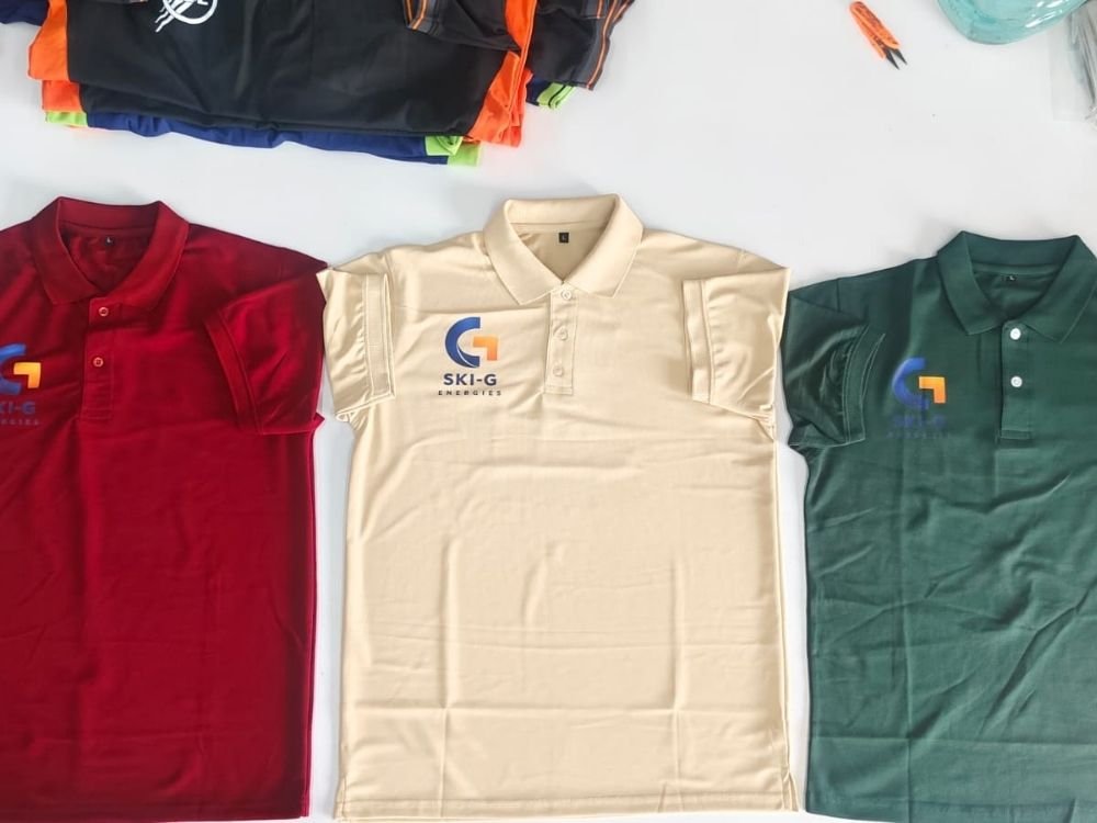
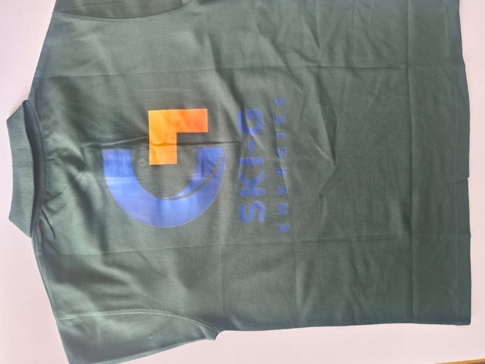
This portfolio case study showcases a versatile collection of corporate polo T-shirts designed by Rage Collections for SKI-G Energies. Presented in rich maroon, neutral beige, and deep green colorways, the garments feature a distinct corporate logo on the chest. Explore how flexible color options and clean branding create a unified, professional identity for diverse team members and corporate environments.
T-Shirt Introduction
This case study examines a multi-color series of polo T-shirts created by Rage Collections for the energy sector enterprise SKI-G Energies. Built on a classic polo silhouette featuring a standard collar and button placket, the collection offers multiple distinct color options including maroon, beige, and dark green.
Concept and Idea
The core concept centers on corporate versatility, brand consistency, and professional identity. The idea was to provide a flexible apparel lineup that accommodates different departmental preferences or styling requirements while maintaining a unified corporate look under a single brand.
Design Story
The design tells a direct story of corporate branding across varied color palettes:
- Chest Logo Placement: Each polo features a clean corporate emblem positioned on the chest.
- Brand Typography: The emblem combines a stylized blue-and-orange icon with the bold name “SKI-G ENERGIES”.
- Color Variations: The design is adapted across rich maroon, professional beige, and deep green fabric bases to offer aesthetic variety.
Purpose and Target Audience
- Primary Purpose: To serve as adaptable corporate merchandise and staff uniforms for SKI-G Energies.
- Target Audience: Company personnel, administrative teams, and field representatives looking for professional, comfortable daily workwear.
Challenges
A key design challenge was ensuring that the corporate logo and typography remained sharp and easily legible across three entirely different background fabric colors—maroon, beige, and green. Maintaining color harmony without altering the core brand identity required careful coordination.
Creative Process
- Color Palette Expansion: Selecting a sophisticated range of hues—deep maroon, neutral beige, and dark green—to give the client versatile options.
- Logo Scale Consistency: Positioning the SKI-G Energies emblem uniformly on the chest across all color variants to preserve visual brand standards.
- Fabric and Silhouette Alignment: Utilizing a classic polo structure to ensure a consistent, professional fit across the entire merchandise line.
What Makes the T-Shirts Special
What sets this collection apart is its adaptable multi-color approach to corporate apparel. By offering the same clean branding across distinct colorways, the collection provides companies with the flexibility to outfit different teams or preferences while keeping their brand presentation cohesive.
Final Result
The final result is a polished, professional line of polo T-shirts that blends functional comfort with strong corporate identity. The varied color options offer a stylish, coordinated presentation suitable for everyday business operations.
How It Represents Rage Collections
This project demonstrates Rage Collections’ ability to execute multi-color corporate merchandise programs tailored to corporate clients. It highlights the brand’s skill in maintaining logo consistency and aesthetic quality across diverse fabric colors and apparel lines.