Rage Collections x Global Enterprises & Electrical: Industrial Workwear Case Study
Project Summary
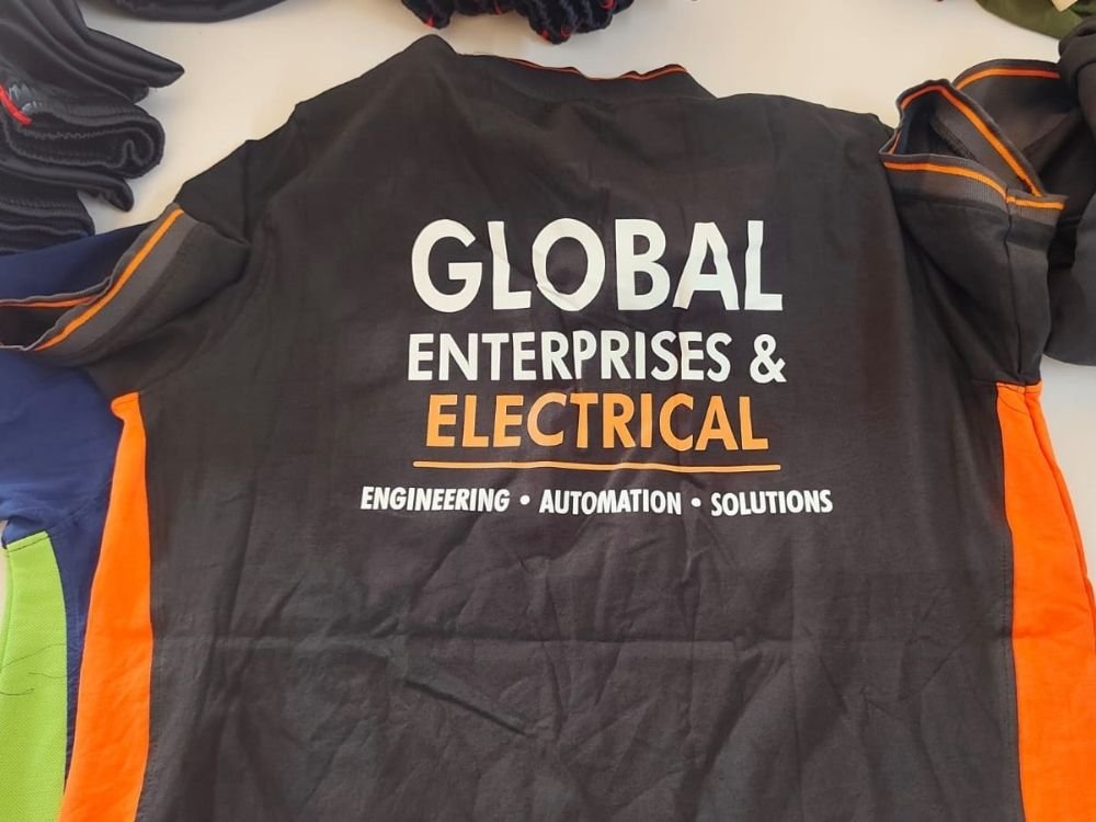
This portfolio case study showcases a professional dark charcoal and orange workwear polo T-shirt designed by Rage Collections for Global Enterprises & Electrical. The project highlights an industrial corporate merchandise concept featuring bold typography and vibrant side panel blocking. Discover how high-contrast design elements unite technical professionalism with robust brand identity for engineering and automation professionals.
T-Shirt Introduction
This case study examines a rugged, dark charcoal-grey polo T-shirt created by Rage Collections for Global Enterprises & Electrical. Built for durability and active site environments, the garment combines a professional dark base with vibrant orange side panels and sleeve trim, serving as specialized corporate workwear.
Concept and Idea
The core concept centers on industrial reliability, safety visibility, and strong corporate identity. The idea was to design a functional workwear piece for an engineering and automation firm that balances a serious, professional dark backdrop with energetic hazard-orange highlights to represent industrial activity.
Design Story
The design tells a clear visual story tailored specifically for an engineering enterprise:
- Prominent Typography: The back features bold white lettering for “GLOBAL” and “ENTERPRISES &,” paired with striking orange text for “ELECTRICAL” underscored by a solid line.
- Core Specialization: A clean subtitle reads “ENGINEERING • AUTOMATION • SOLUTIONS,” instantly communicating the company’s technical core services.
- Color Blocking: Vivid orange side panels and collar accents frame the dark fabric, enhancing both style and on-site visual presence.
Purpose and Target Audience
- Primary Purpose: To serve as official technical workwear and staff uniforms for engineers, technicians, and field staff.
- Target Audience: Industrial workers, automation specialists, and engineering teams needing robust, professional apparel that represents their company on-site.
Challenges
A key design challenge was integrating multiple layers of text—company name, core sector, and technical services—onto the back of a work shirt without making it look crowded. Ensuring strong legibility across both white and orange typography against a dark charcoal background required careful spacing and font weight selection.
Creative Process
- Industrial Color Pairing: Selecting a deep charcoal-grey fabric paired with high-visibility orange to match industrial safety and aesthetic standards.
- Hierarchical Typography: Structuring the company name in large, dominant text while neatly organizing the technical descriptor below it.
- Accent Placement: Utilizing side panels and collar piping to tie the color scheme together harmoniously.
What Makes the T-Shirt Special
What sets this garment apart is its purposeful blend of industrial safety cues and clean corporate branding. The strategic use of safety orange alongside technical typography transforms standard technical workwear into a sharp, unified brand statement.
Final Result
The final result is a professional, durable polo T-shirt that marries safety visibility with sleek corporate design. It offers a practical and authoritative appearance well-suited for demanding technical environments.
How It Represents Rage Collections
This project demonstrates Rage Collections’ capability to design specialized workwear for the heavy engineering and industrial sectors. It highlights the brand’s skill in balancing safety aesthetics, clear technical typography, and corporate identity into effective, everyday professional apparel.