Rage Collections x D Events: Corporate Merchandise Case Study
Project Summary
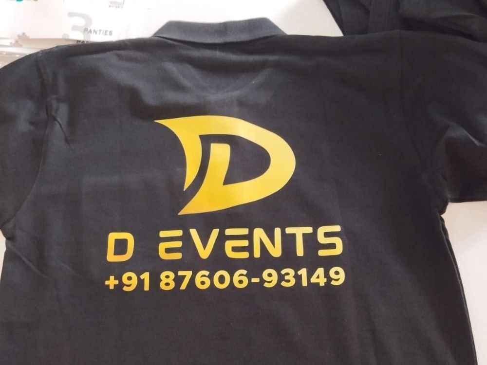
This portfolio case study showcases a sleek black polo T-shirt designed by Rage Collections for D Events. The project highlights a professional corporate merchandise concept featuring a bold, stylized yellow ‘D’ logo paired with the company name and contact number on the back. Discover how this striking high-contrast design creates a unified, recognizable look for event management professionals on duty.
T-Shirt Introduction
This case study examines a solid black polo T-shirt created by Rage Collections for the event management company D Events. Built on a classic polo silhouette with a traditional collar, the garment functions as official branded apparel designed to ensure high visibility and team cohesion during fast-paced events.
Concept and Idea
The core concept focuses on brand visibility, professional identity, and practical communication. The idea was to create a clean, authoritative uniform piece that allows event staff to be easily identified by clients and attendees while prominently displaying essential brand contact details.
Design Story
The design tells a direct story of corporate branding and accessibility:
- Back Graphic: A prominent, stylized yellow ‘D’ logo sits proudly at the top.
- Company Typography: Directly beneath the logo, the name “D EVENTS” is displayed in bold, modern lettering.
- Contact Details: The brand’s phone number (
+91 87606-93149) is cleanly integrated at the base of the design, ensuring immediate accessibility for prospective clients.
Purpose and Target Audience
- Primary Purpose: To serve as professional workwear and promotional apparel for event coordinators and staff working under D Events.
- Target Audience: Event organizers, team members, and clients looking for a dependable, easy-to-identify professional presence at weddings, corporate gatherings, and large functions.
Challenges
A major design challenge was arranging multiple informational elements—a graphic logo, company name, and a full phone number—on the back of a garment without making the layout look cluttered. Achieving a balanced hierarchy that maintained strong readability from a distance required precise spatial planning.
Creative Process
- High-Contrast Palette: Selecting a vibrant yellow print against a deep black fabric to maximize legibility and visual impact.
- Typographic Scaling: Organizing the company name and telephone number with balanced font weights so the branding remains clear and prominent.
- Logo Placement: Centering the stylized ‘D’ emblem at the upper back to establish an immediate focal point before drawing the eye to the text below.
What Makes the T-Shirt Special
What sets this T-shirt apart is its functional approach to corporate apparel. By seamlessly blending a bold brand emblem with direct contact information on a classic black polo, the garment doubles as an effective, wearable marketing tool in crowded event environments.
Final Result
The final result is a sharp, professional polo T-shirt that balances functional utility with striking visual branding. It offers a clean presentation that helps event personnel maintain a polished, unified identity while on site.
How It Represents Rage Collections
This project highlights Rage Collections’ ability to design practical, brand-focused corporate merchandise tailored to specific service industries. It demonstrates the brand’s skill in transforming essential business details into clean, wearable apparel solutions.