Rage Collections x Friends Pet Polymers: Corporate Merchandise Case Study
Project Summary
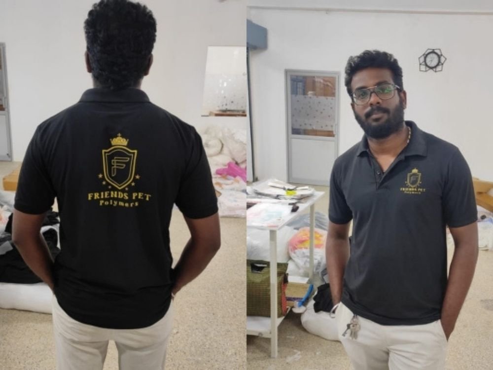
This portfolio case study highlights an elegant black polo T-shirt designed by Rage Collections for Friends Pet Polymers. Featuring a classic collar and striking gold corporate emblem, the garment reflects professional identity and brand presence. Discover how sophisticated color choices and minimalist design come together to create premium corporate merchandise suitable for industrial manufacturing and team environments.
T-Shirt Introduction
This case study examines a sleek, solid black polo T-shirt created by Rage Collections for the manufacturing company Friends Pet Polymers. Built on a traditional polo silhouette with a standard collar and button placket, the garment serves as sophisticated corporate attire designed to convey professionalism and team unity.
Concept and Idea
The core concept centers on corporate identity, professionalism, and understated elegance. The idea was to create a garment that feels both authoritative and approachable, utilizing a sophisticated black-and-gold color scheme to communicate quality and reliability in an industrial sector.
Design Story
The design tells a story of modern corporate branding:
- Front Branding: A refined shield-shaped emblem on the left chest features a crown element and the letter “F,” framed by subtle stars.
- Back Graphic: The back repeats this distinctive crest above clean typography reading “FRIENDS PET POLYMERS,” establishing a clear and professional brand signature.
Purpose and Target Audience
- Primary Purpose: To serve as official staff uniforms and corporate merchandise for Friends Pet Polymers.
- Target Audience: Company employees, management teams, and representatives looking for professional, cohesive apparel for daily operations or business interactions.
Challenges
A key design challenge was balancing high-contrast visibility with a clean, professional aesthetic on a dark fabric background. Ensuring the metallic gold details remained distinct and readable without appearing overly flashy required careful layout planning and color tone selection.
Creative Process
- Color Palette Selection: Choosing a deep black fabric as the base to provide a sharp contrast for the gold graphics.
- Emblem Placement: Sizing and positioning the crest on both the chest and back to maintain visual balance and strong brand recognition.
- Typography Scaling: Selecting a clean, legible font for the company name to complement the stylized shield logo.
What Makes the T-Shirt Special
What sets this T-shirt apart is its restrained elegance and strong corporate aesthetic. The combination of a classic black polo with metallic gold branding elevates standard workwear into a stylish piece of company merchandise that instills pride and professionalism.
Final Result
The final result is a polished, professional polo T-shirt that merges functional comfort with high-end corporate styling. It offers an understated yet memorable look that presents a unified brand image for the company.
How It Represents Rage Collections
This project demonstrates Rage Collections’ expertise in developing tailored corporate identity apparel. It highlights the brand’s ability to translate business values into clean, professional clothing solutions that align with specific industry requirements.